web analytics dashboard
web analytics dashboard designed in figma
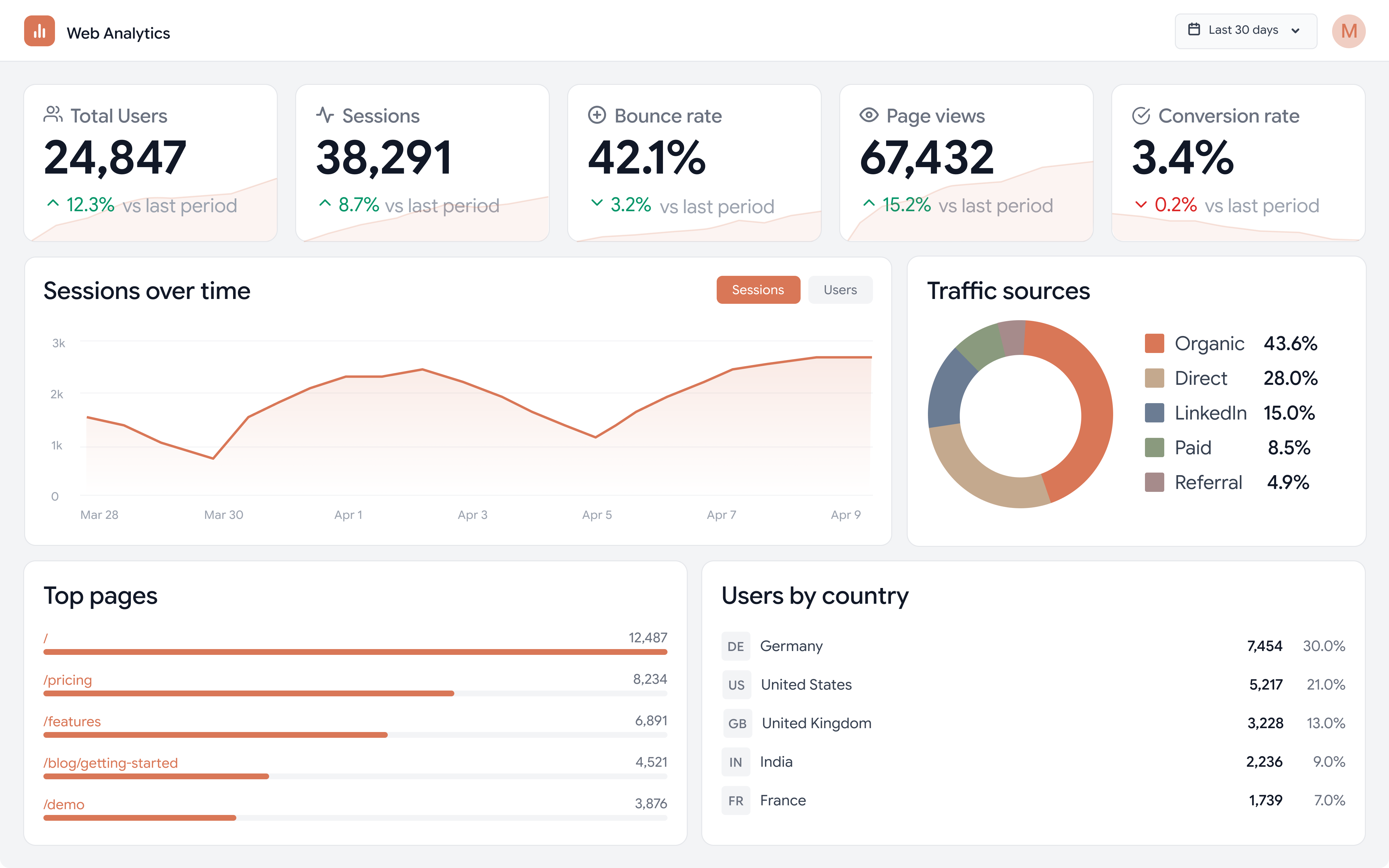
data-dense but visually clear
the goal was to design a clean, data-dense analytics dashboard that felt modern without being visually overwhelming. inspired by anthropic's light, minimal design aesthetic, the dashboard presents key website metrics -- users, sessions, bounce rate, page views, and conversion rate -- alongside supporting visualizations for traffic sources, top pages, and geographic distribution. the challenge was fitting five kpi cards, two charts, and two data tables into a single viewport while maintaining visual clarity and hierarchy.
structured hierarchy in figma
the dashboard was designed entirely in figma. the layout follows a clear top-down hierarchy: kpi summary cards at the top with embedded sparklines that hint at trends, a sessions-over-time area chart as the primary visualization, and supporting breakdowns (traffic sources donut chart, top pages bar chart, users by country table) at the bottom. the color palette uses a warm coral accent for data visualization, keeping the interface cohesive. typography and spacing follow a tight grid system to maximize information density without sacrificing readability.